IRCTC - App Redesign
An interface to interact with the company in a conversational way.
Project Description
Redesigning the IRCTC app to create a seamless and intuitive ticket-booking experience, addressing current usability challenges and enhancing user satisfaction for millions of travellers.
Core
Product design
Tags
Research | Product Design
My role
Designer | User Testing
Brief
The project aims to streamline the booking process, improve information architecture, and incorporate user-centric features that cater to the diverse needs of Indian railway passengers.
Make the booking process more intuitive and user-friendly, especially for differentiating between one-way and round-trip tickets
Create a consistent and visually appealing user interface across all screens
Improve post-booking features like ticket status, cancellation, and refunds
The challenge
IRCTC stands for Indian Railway Catering and Tourism Corporation. It is a public sector undertaking owned by the Government of India through the Ministry of Railways.
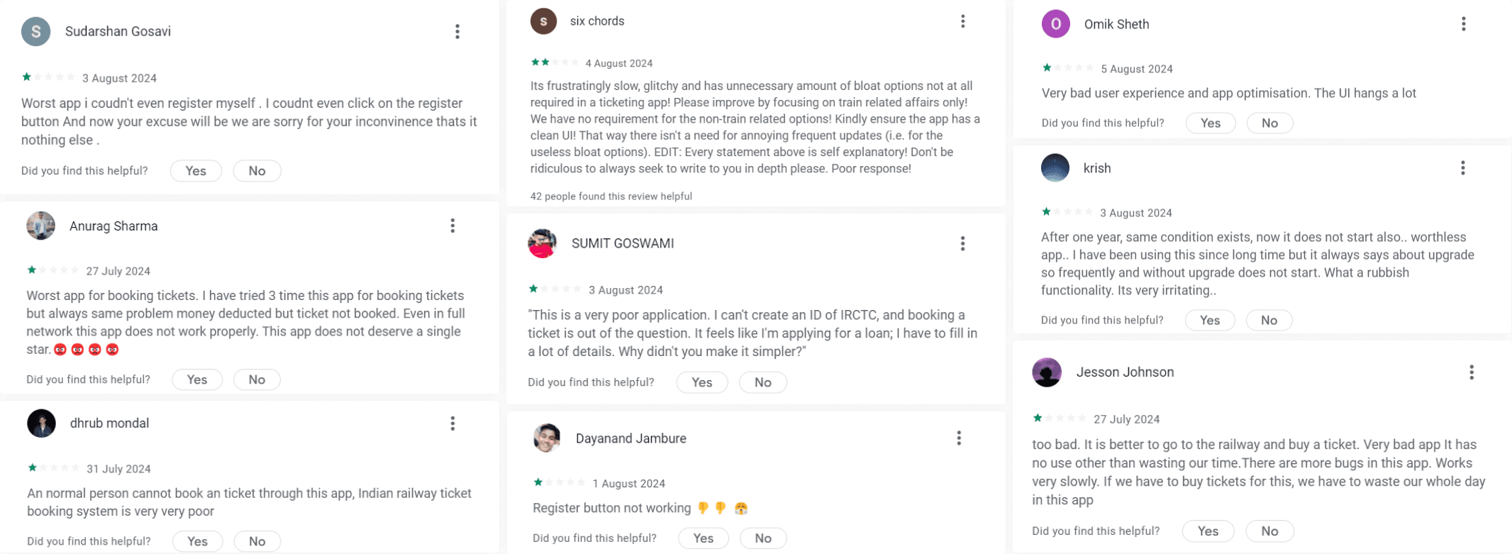
I decided to redesign the IRCTC app after facing some challenges while booking a ticket. A few of my friends suggested using the website or a third-party app instead, which made me realize there were clear issues with the app. This prompted me to dive into user reviews and conduct surveys across different age groups to understand their experiences better. All this research motivated me to tackle the redesign and create a more user-friendly app for train ticket bookings.
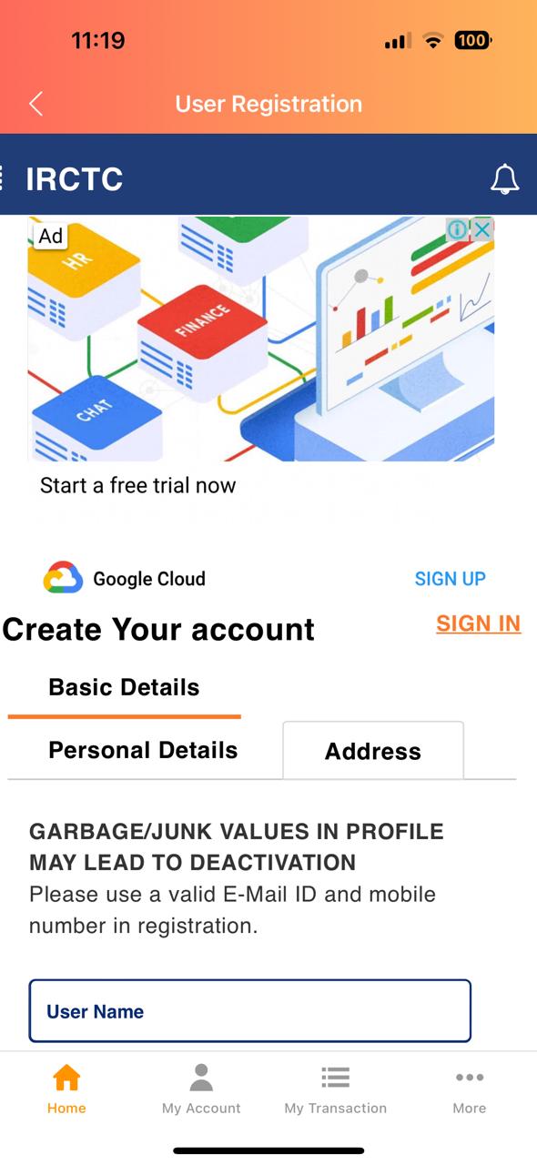
The Problem
Analyzed recent IRCTC app reviews post‑v4.2.25 (released Jul 9, 2024) to surface recurring UX issues from a large, active user base.
Ran a poll with 40+ travelers on booking preferences: only 45% use the IRCTC app; the rest prefer the website or competitor apps that better address known pain points
Key Takeaways - SWOT Analysis & Competitor Audit
Users find the app's interface overwhelming and difficult to navigate due to excessive clutter.
The app lacks a clear hierarchy, making it challenging for users to access important features like ticket booking.
UI components and styles vary across different sections, leading to a disjointed user experience.
Many useful features are not easily visible, hindering user engagement and functionality.
The app does not meet accessibility standards, making it difficult for users with disabilities to navigate.
There is a strong demand for a redesign that focuses on user needs and preferences to enhance usability.
Style Guide
Colour Palette
#34346A
#F5F5F5
#929292
#D4D5D7
Typography
Font
Inter
Aa
Inter
Bold
Aa
Inter
Semibold
Aa
Inter
Medium
Aa
Inter
Regular
Primary Blue: From the IRCTC logo - trust, reliability, tech-forward. Use for brand moments and primary actions.
Secondary Blue/Grey: Palette-matched for cohesion - calm, neutral. Use for tabs, chips, secondary CTAs.
Cool Greys: Subtle structure - backgrounds, dividers, states. Keep contrast accessible.
White: Clean canvas for readability and spacious layouts.
Usage: Prioritize clarity, limit saturation to actions, ensure AA/AAA contrast.
How to make the experience better?
Simplify the Interface
Declutter the screens by grouping related features and removing unnecessary elements
Use clear information hierarchy to make important functions like ticket booking easily accessible
Improve Navigation
Implement a more intuitive navigation structure with consistent icons and labels
Ensure key features are discoverable and easily found by users
Enhance Usability
Design for users of all ages and technical abilities
Optimize performance to reduce loading times and improve responsiveness
Adopt a Modern Design Language
Use a clean, contemporary visual style with a focus on legibility and ease of use
Implement a consistent design system across all screens and modules
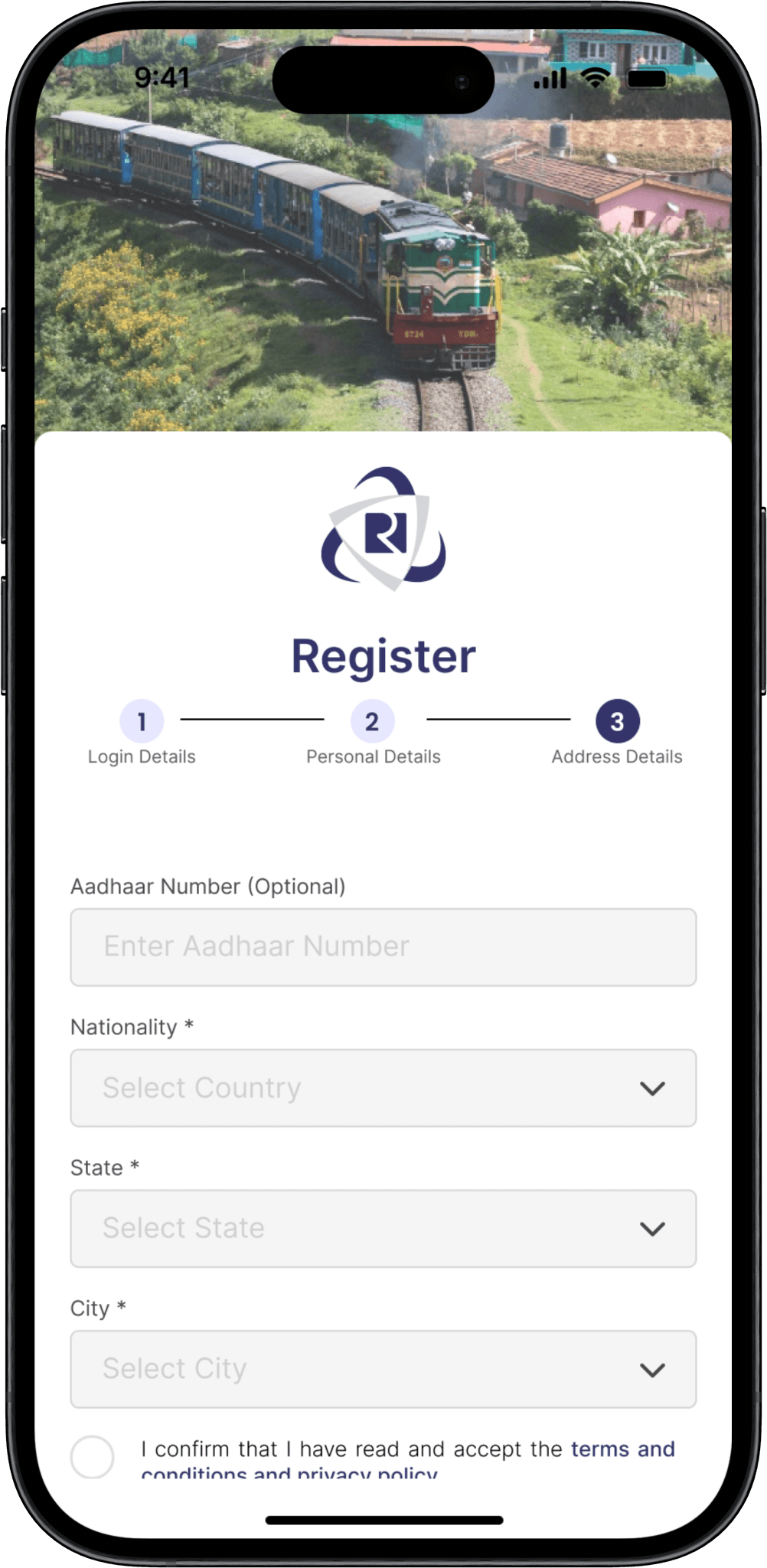
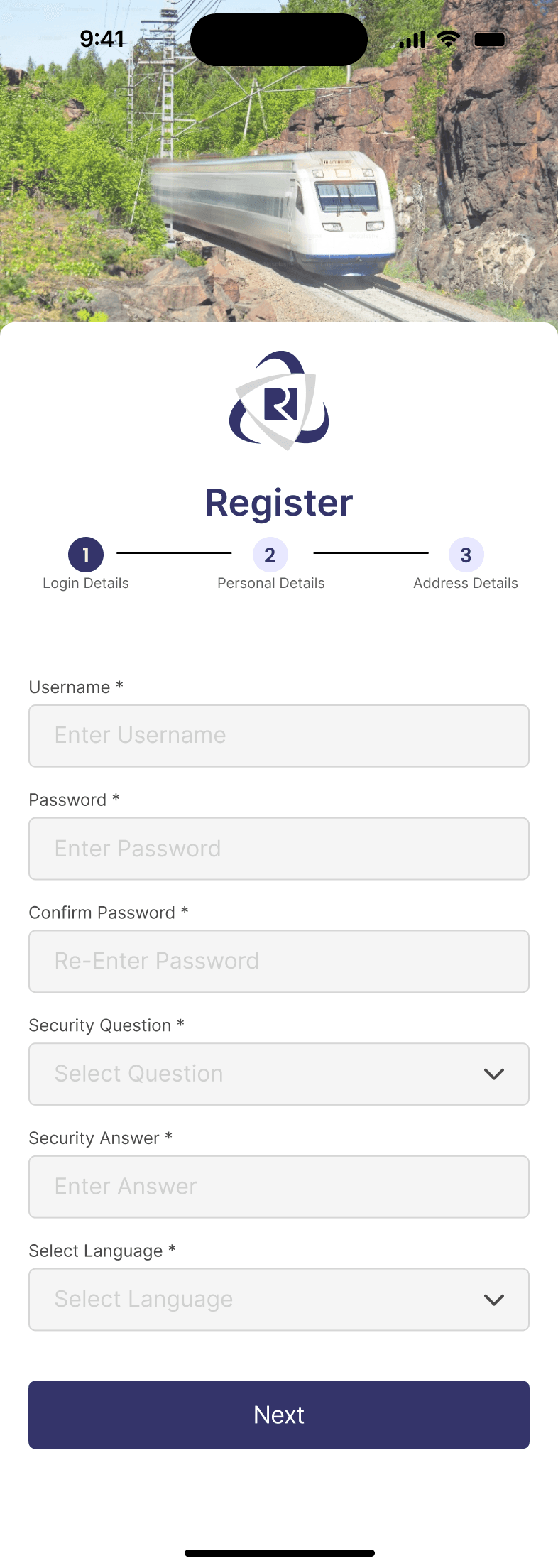
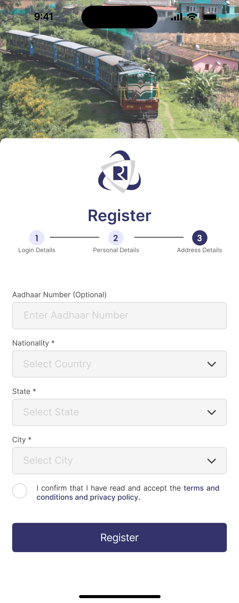
Visual Design
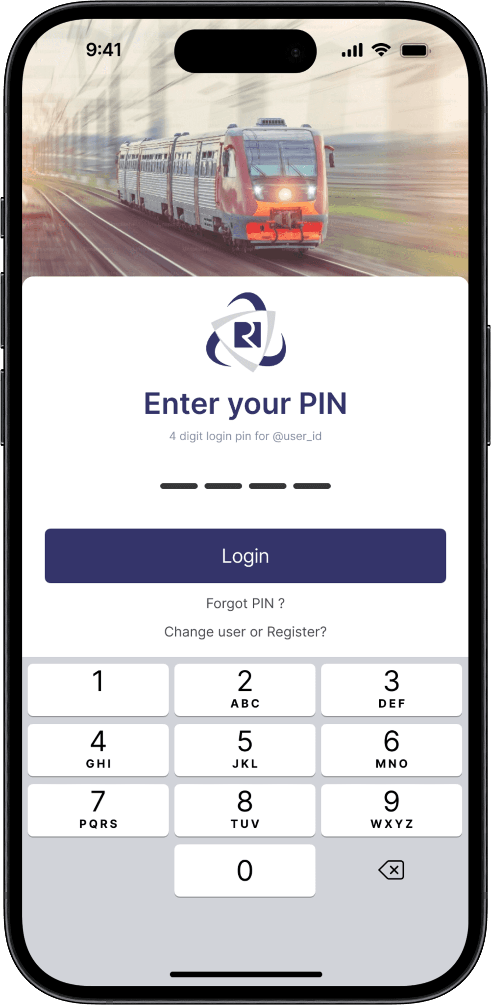
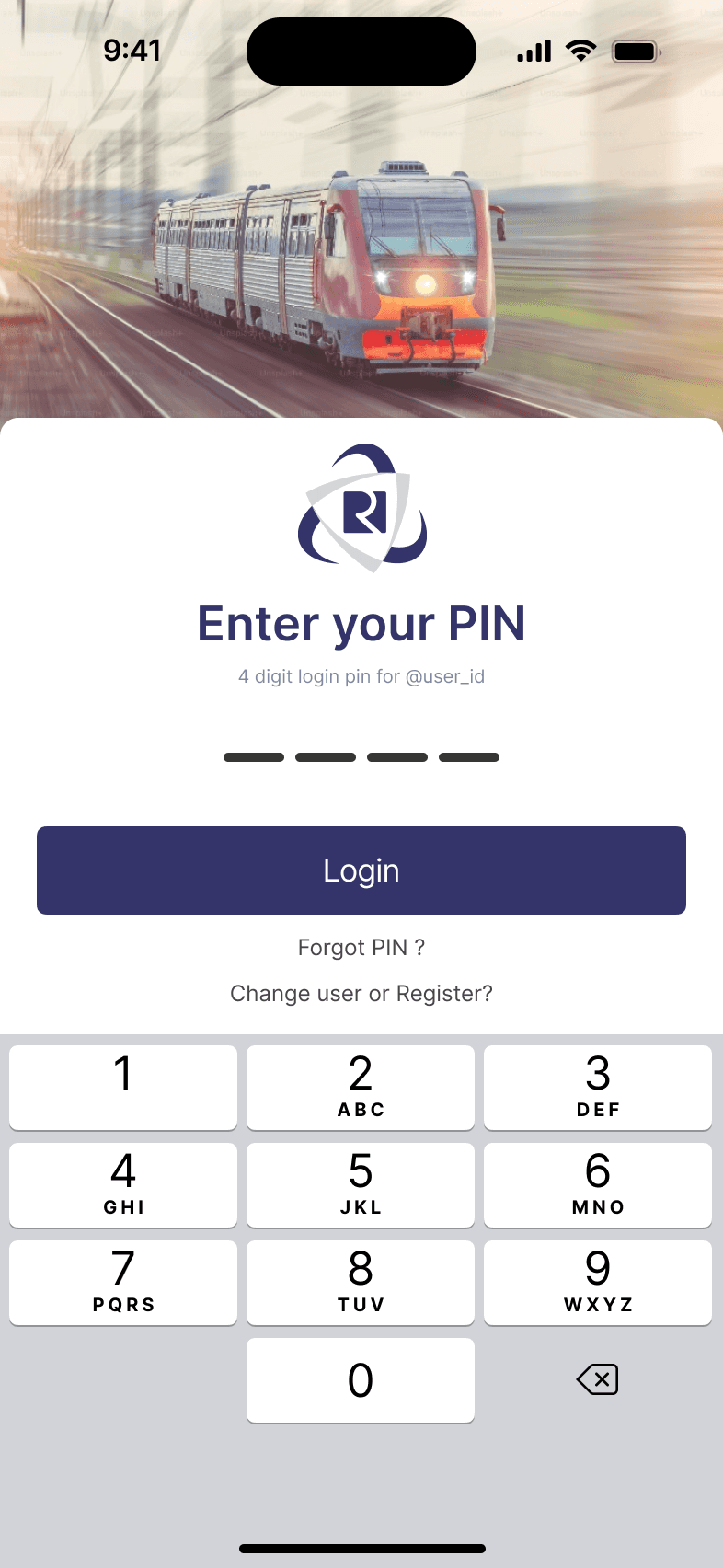
Login Screen - with PIN

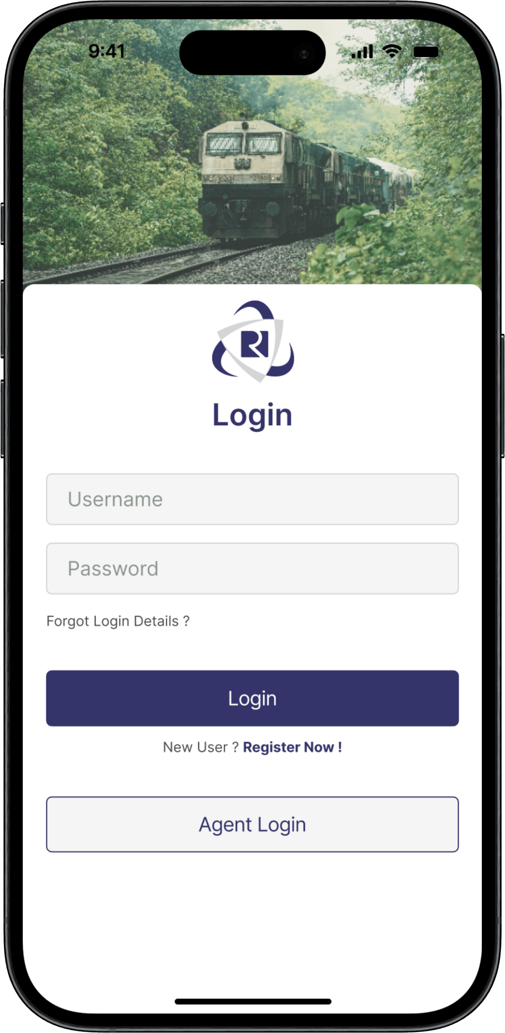
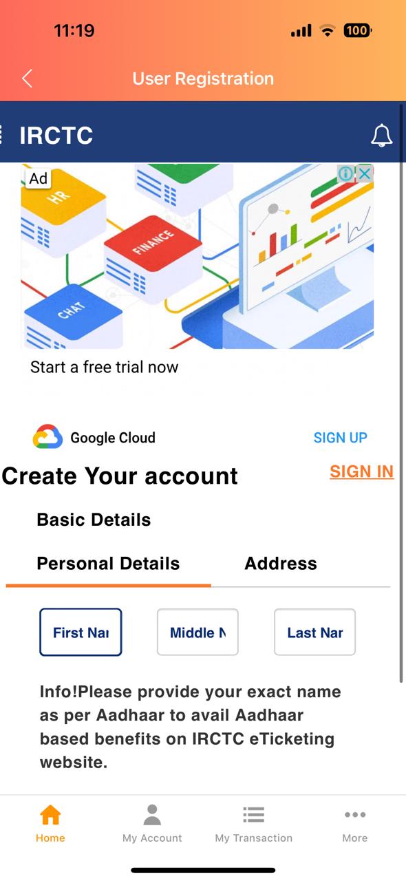
Login Screen - with Username & Password


Login Screen - with Username & Password


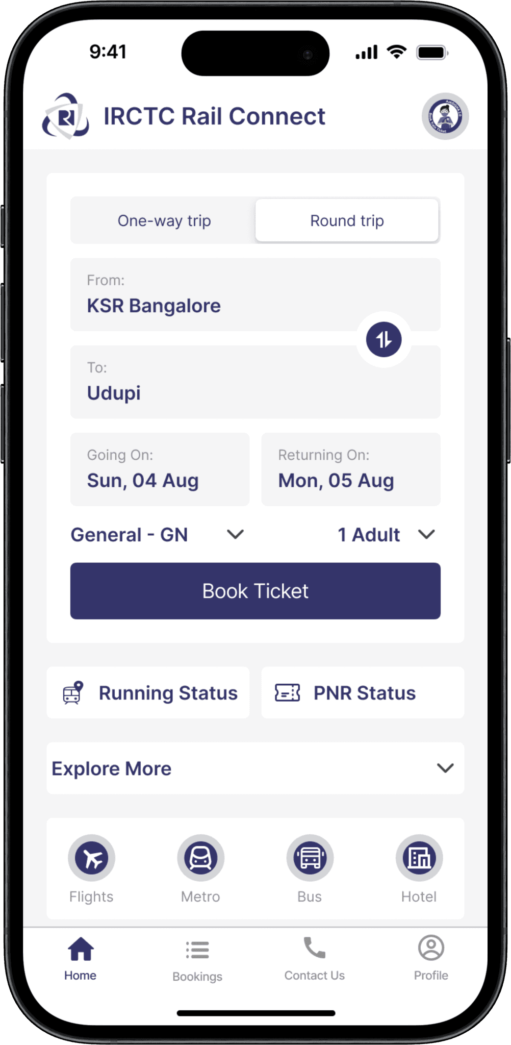
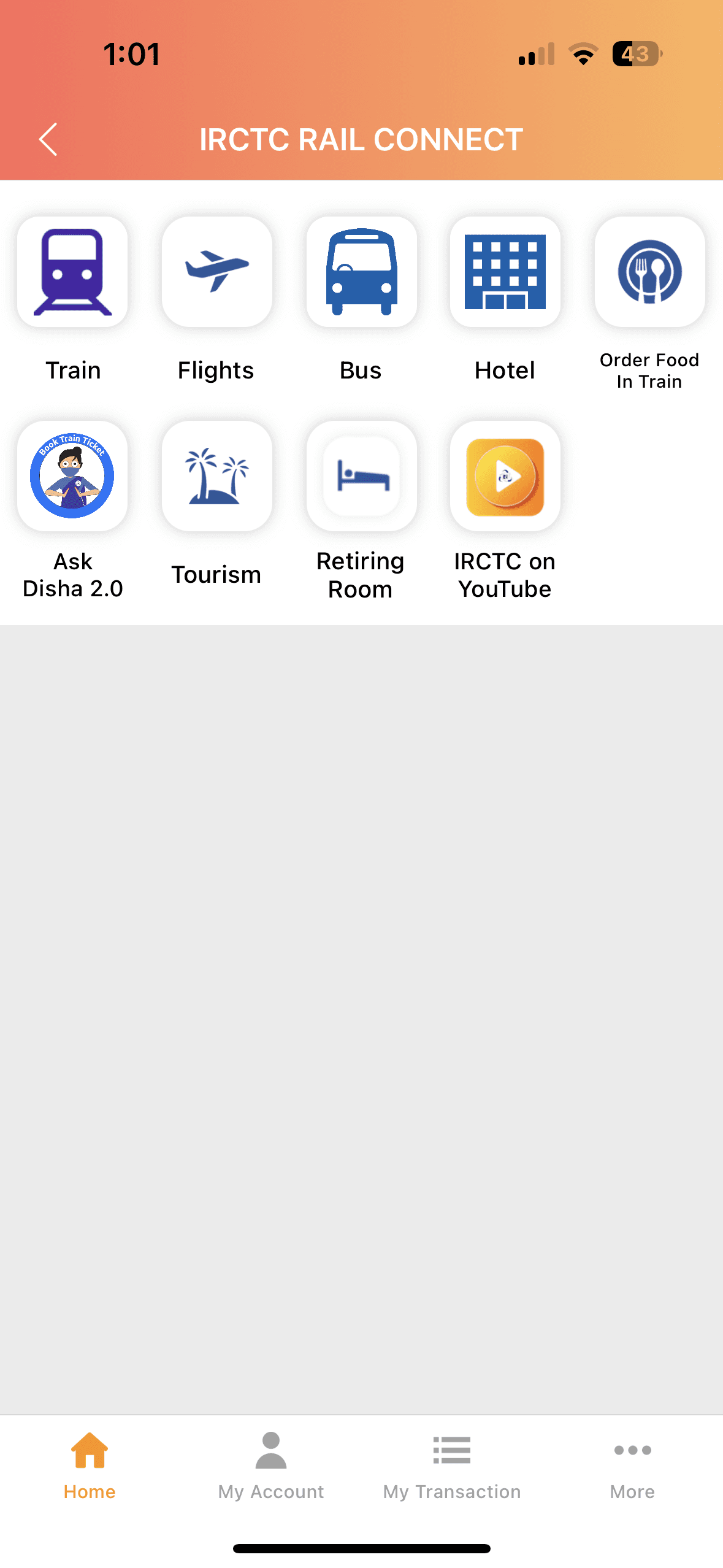
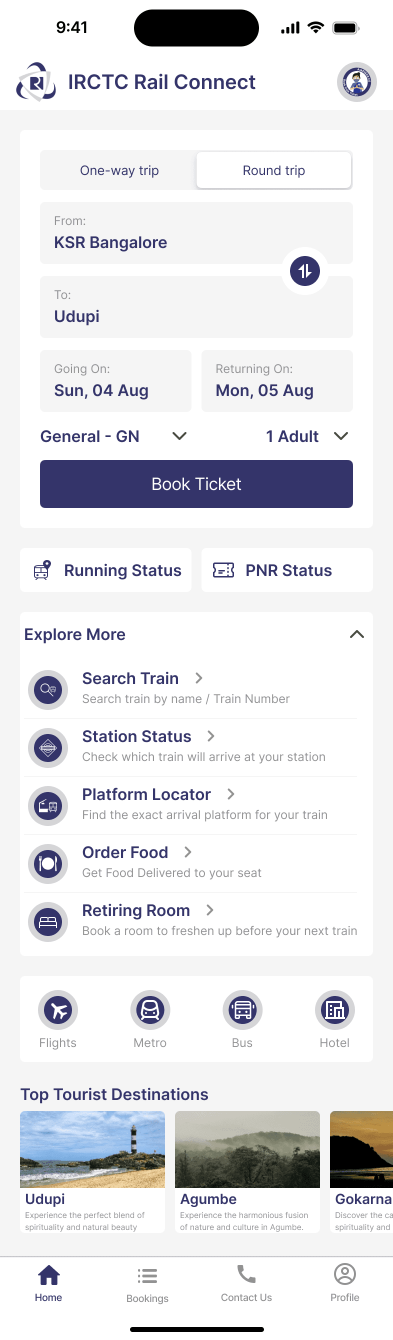
Home Page
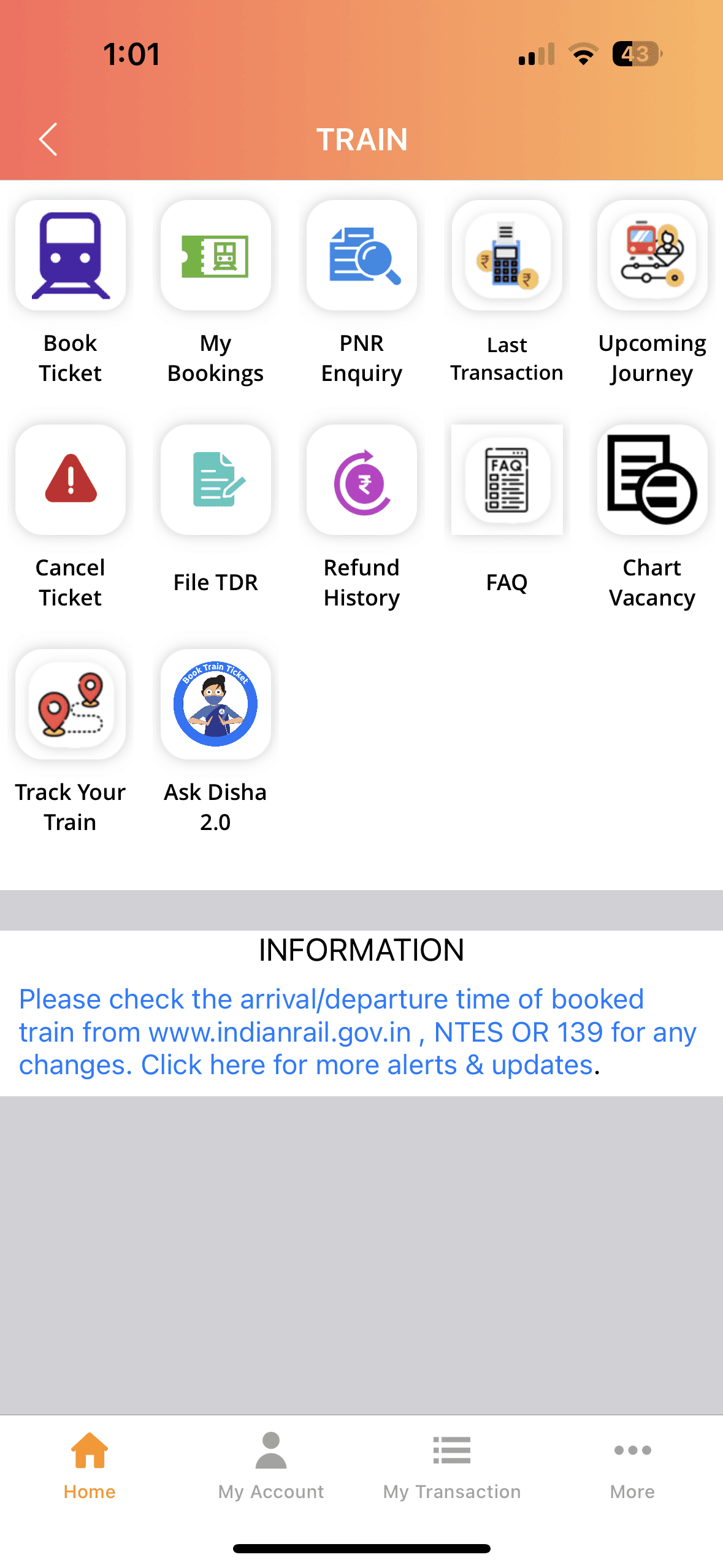


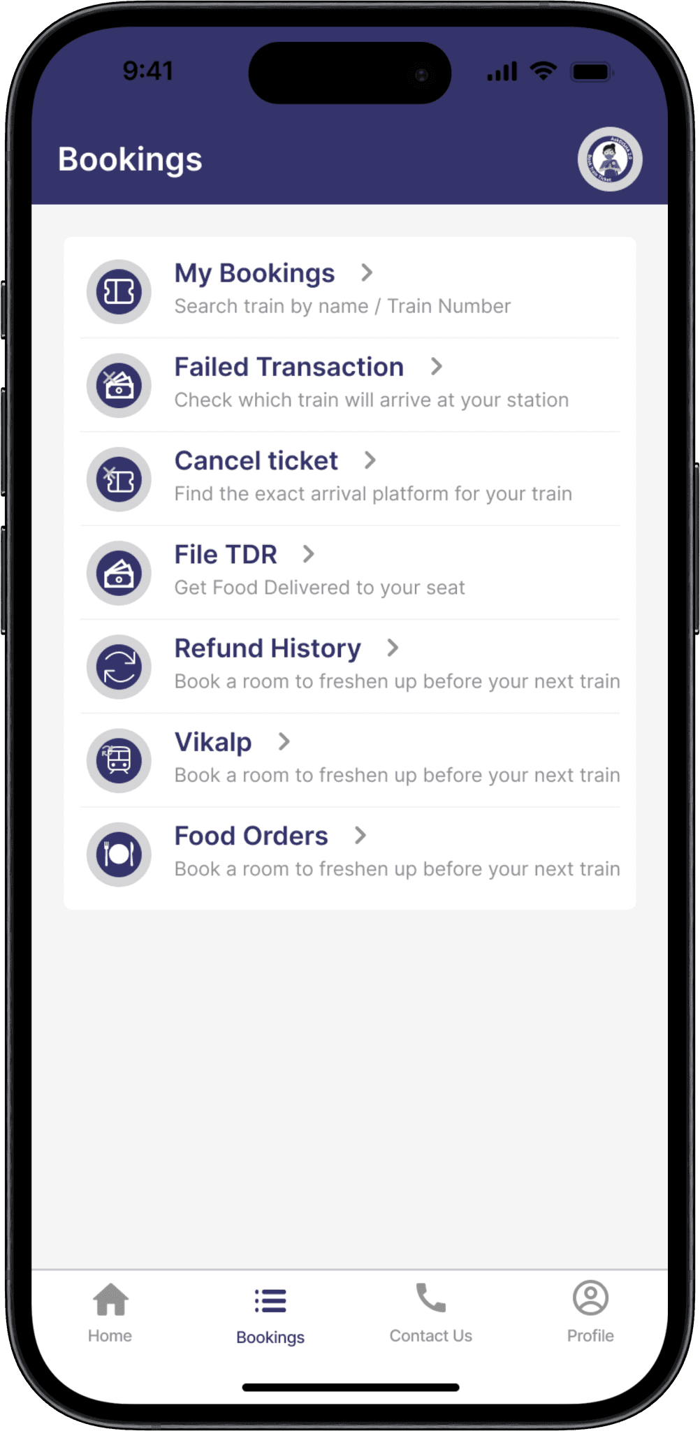
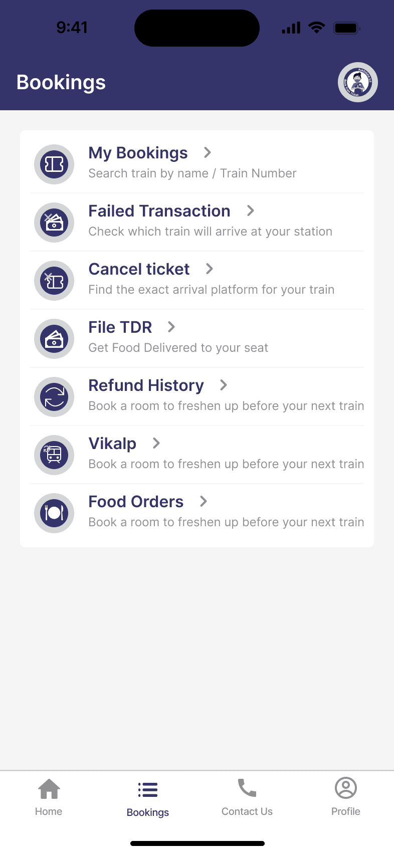
Bookings Page
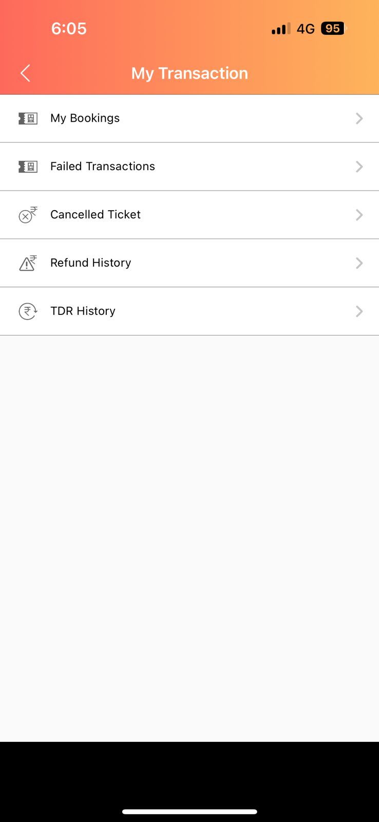
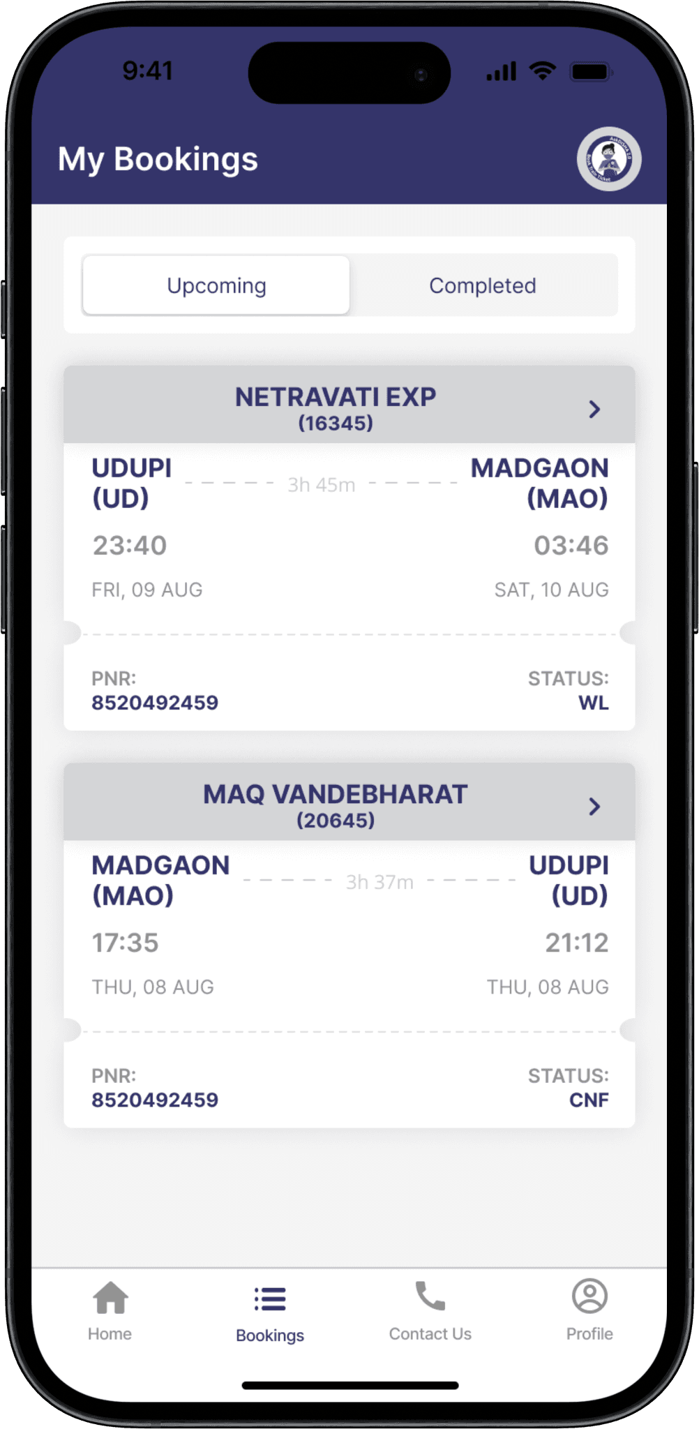
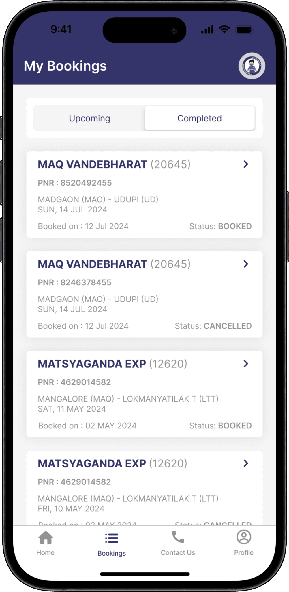
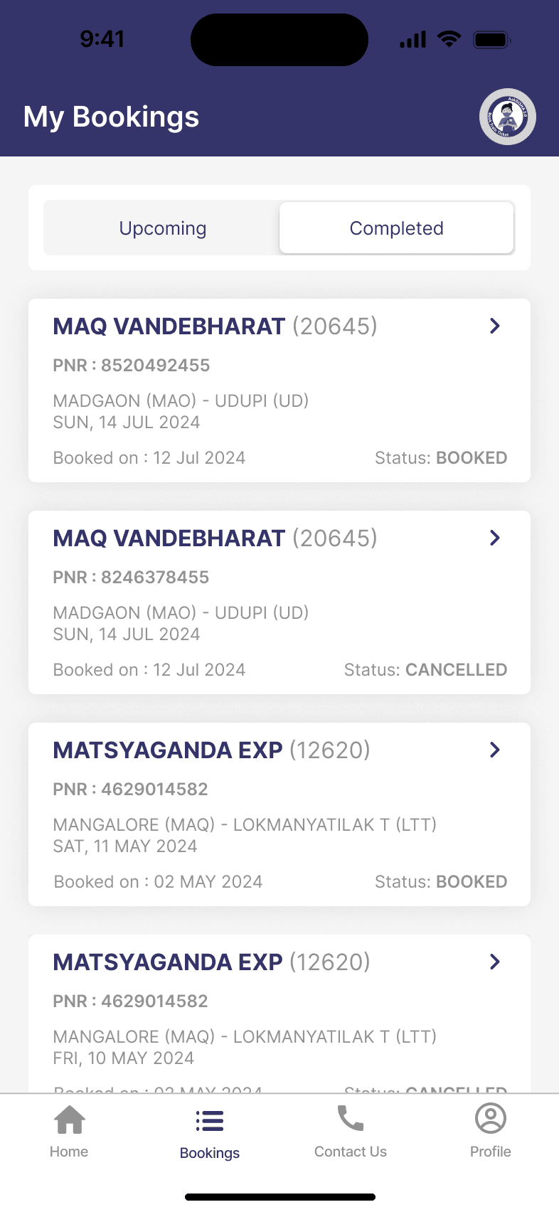
My bookings section


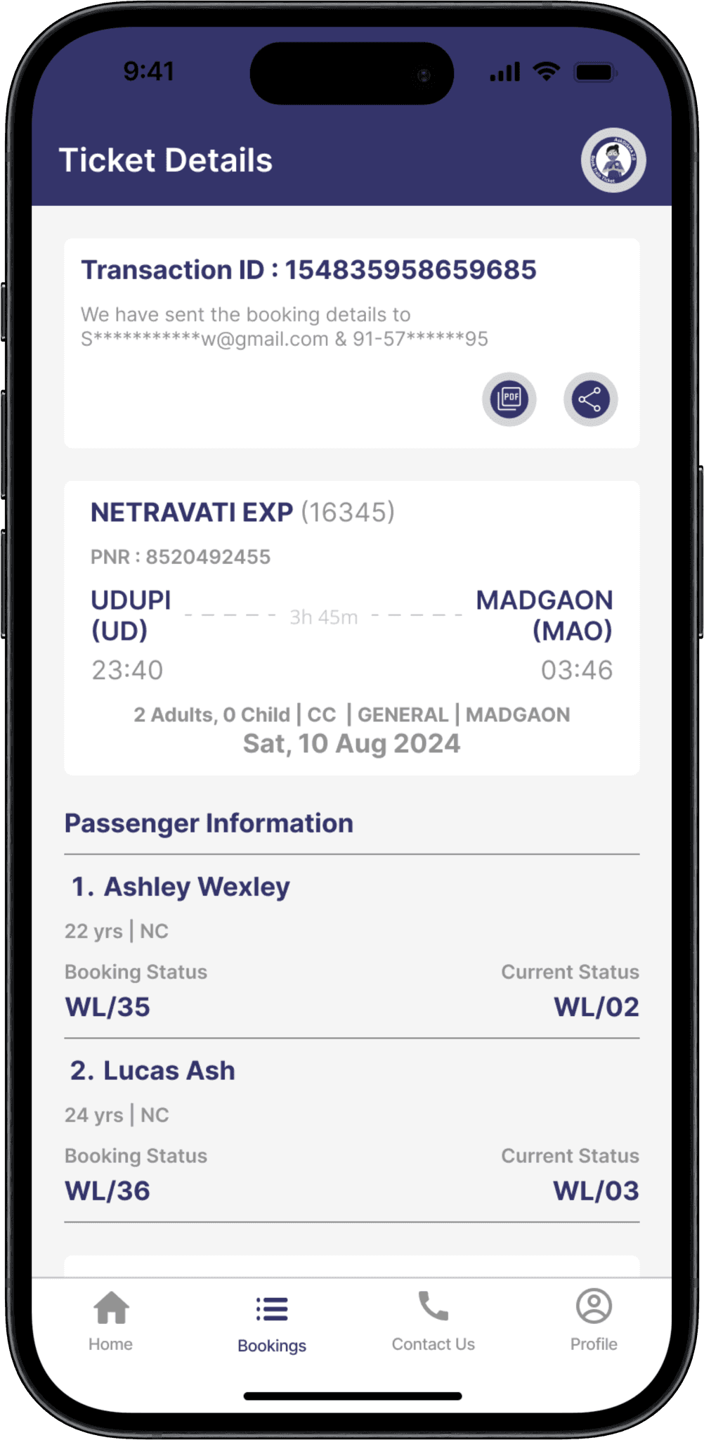
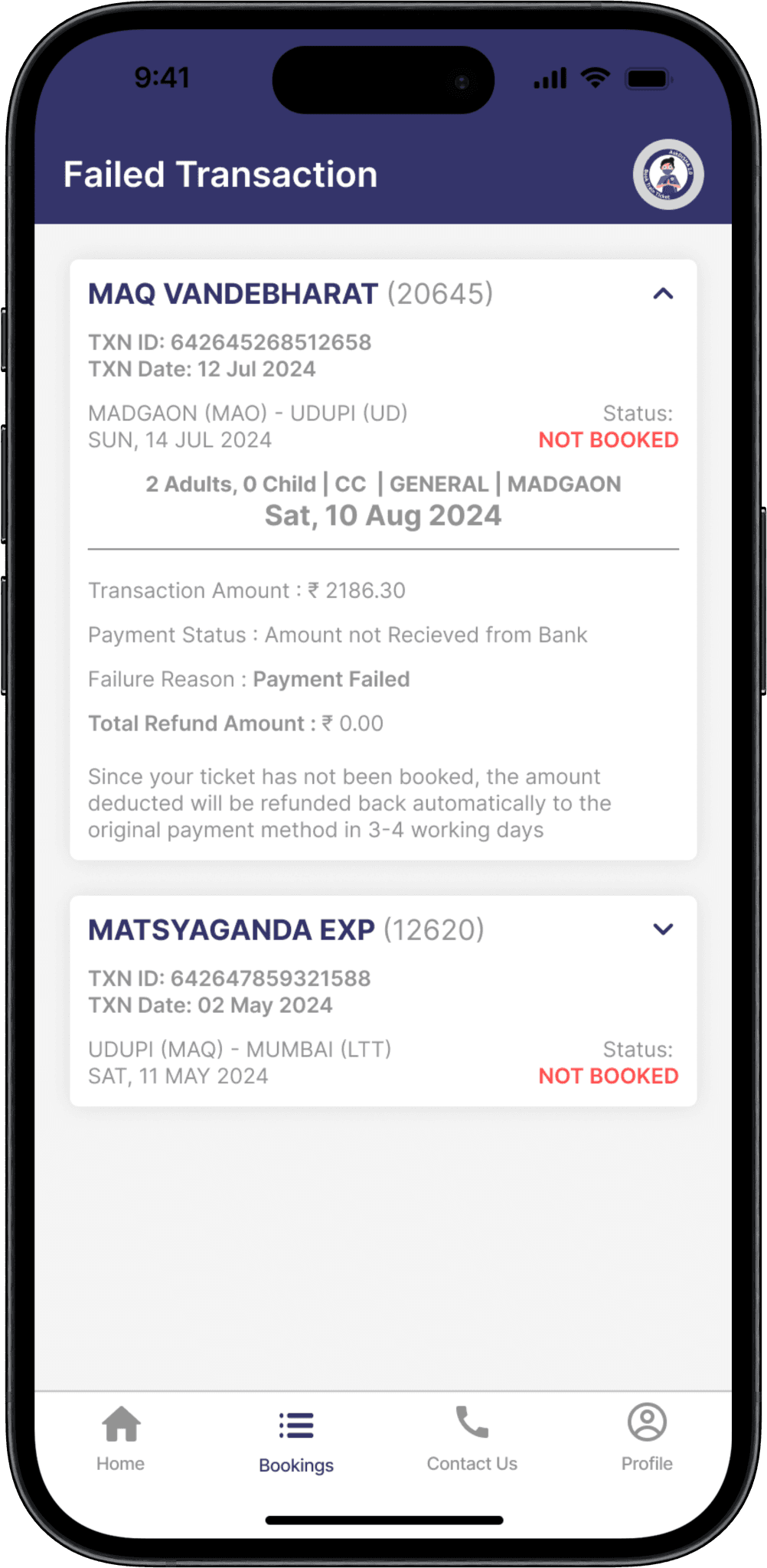
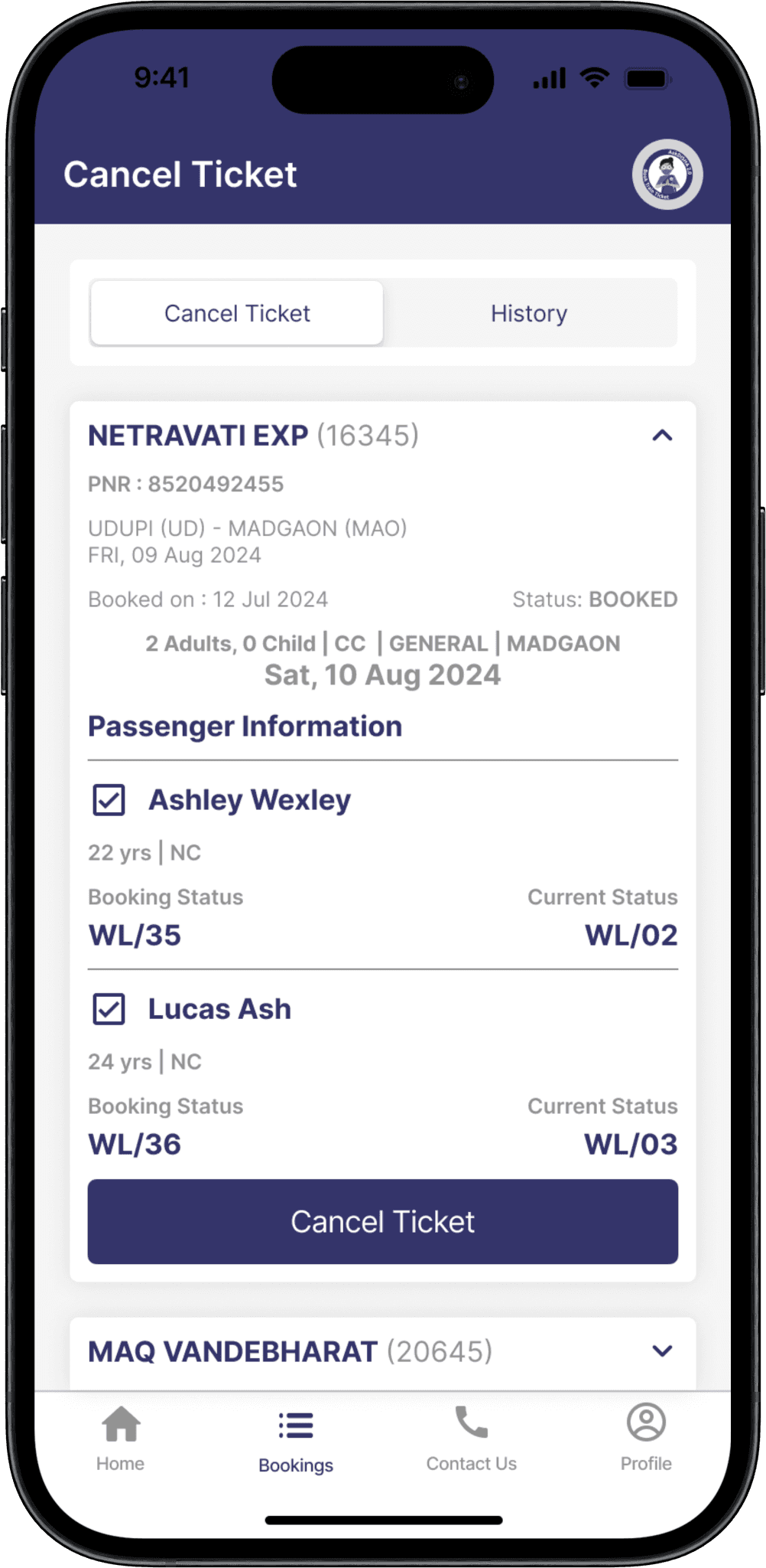
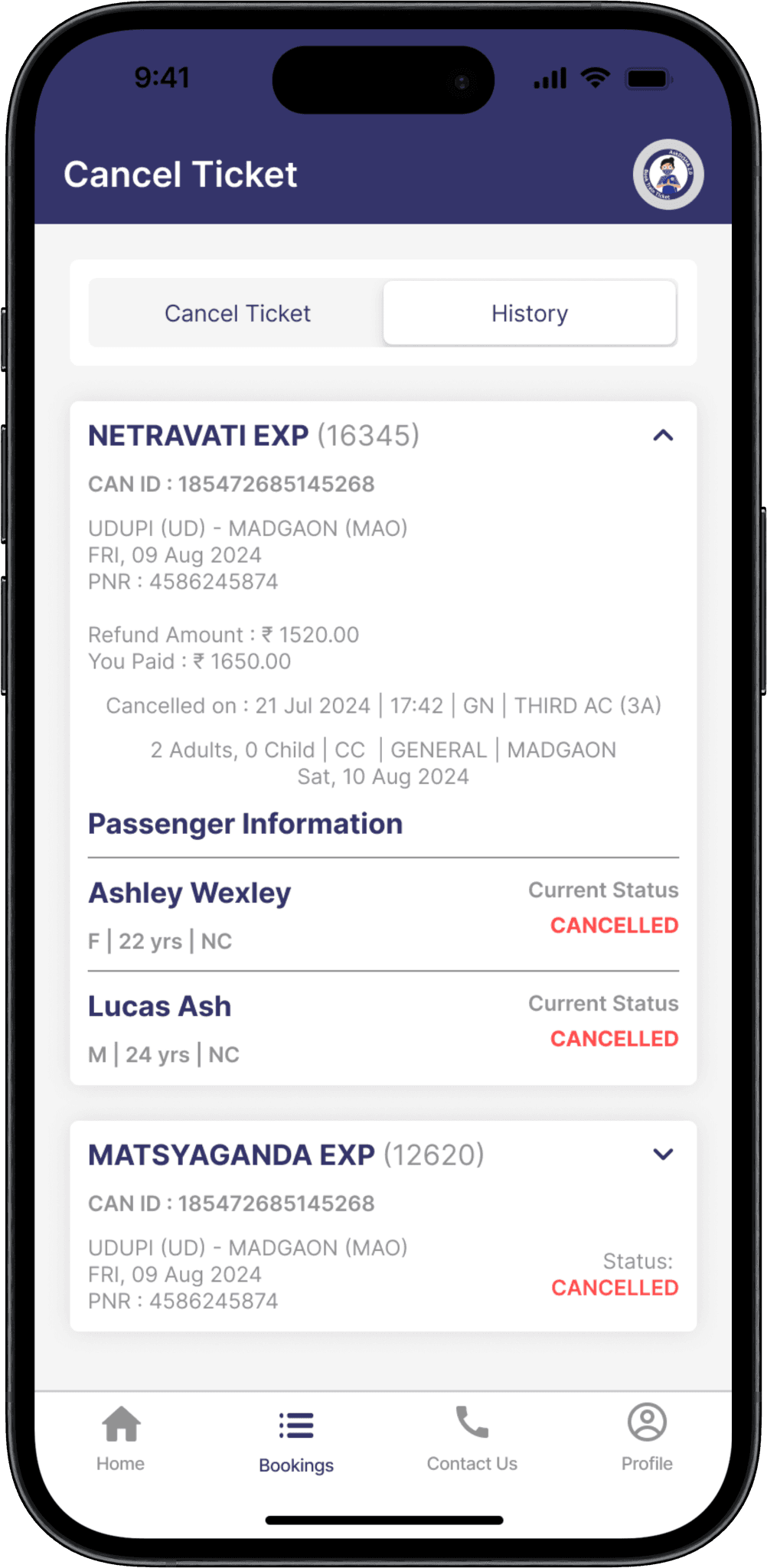
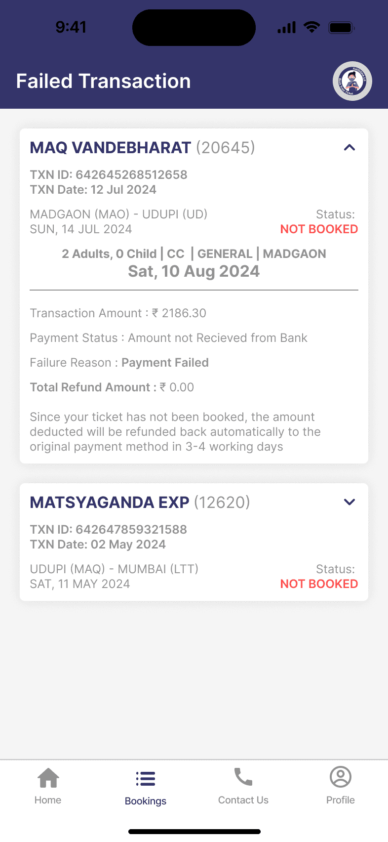
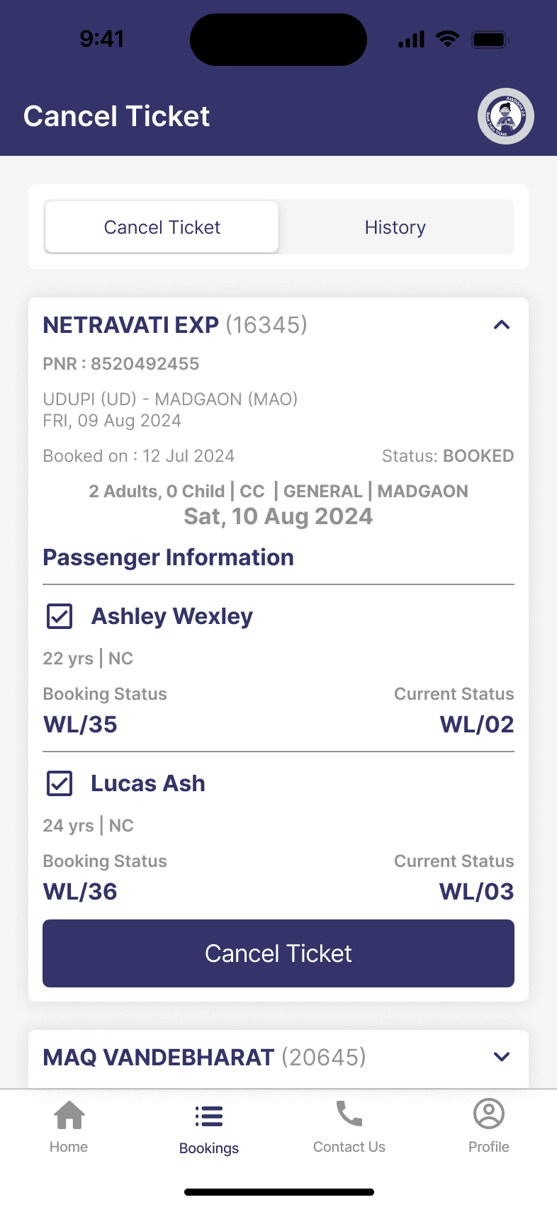
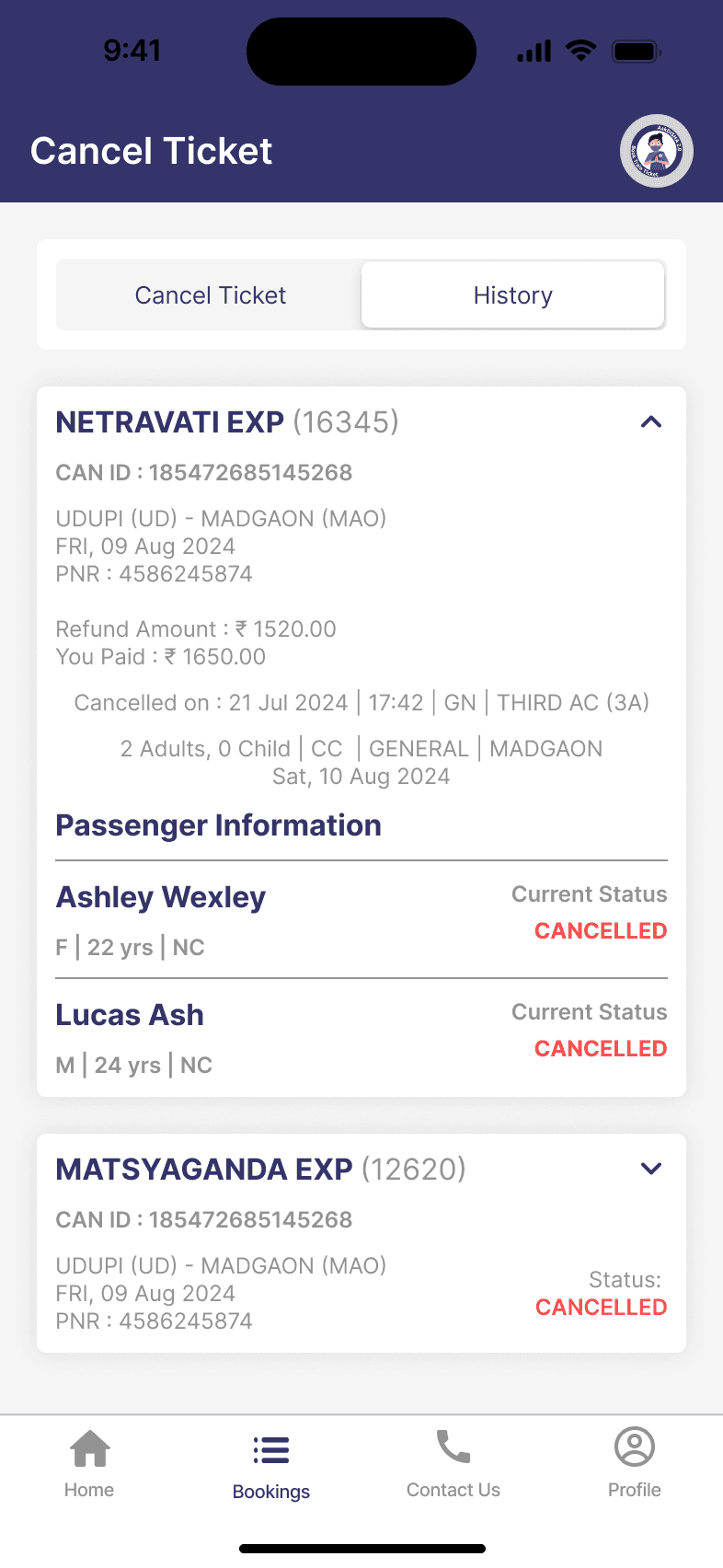
Failed Transaction & Cancel Ticket Page
Learnings
Faced the challenge of creating a user-friendly interface that accommodates the diverse needs of individuals with varying levels of tech-savviness, leading to a deeper understanding of user-centered design principles.
Striking the right balance between a simple interface and comprehensive features was challenging but crucial for ensuring an intuitive user experience.
"People don't need to learn how to book tickets. Apps need to learn how people think."
© 2025 ShraddhaPatil. All rights reserved